
The Complete Guide to Modern Web Design
Studies show that 94% of first impressions are design-related, and users form opinions about your site within 50 milliseconds. Whether you’re a seasoned designer looking to refresh your skills or a business owner aiming to understand the web design process better, this comprehensive guide will walk you through everything you need to know about modern web design in 2025.
From fundamental principles to cutting-edge trends, essential tools to common pitfalls, we’ll cover the entire spectrum of web design knowledge. By the end of this guide, you’ll have a thorough understanding of how to create websites that not only look stunning but also provide exceptional user experiences and achieve business goals.
What is Web Design? Understanding the Fundamentals
Web design is far more than making a website look attractive. It’s the thoughtful process of planning, conceptualizing, and arranging content for online consumption. Modern web design encompasses visual aesthetics, user experience, functionality, and technical performance to create digital experiences that serve both users and business objectives.
Visual Design vs. Web Design
While visual design focuses on the aesthetic appeal of static elements, web design operates in a dynamic, interactive environment. Unlike print design, web designers must consider how users will interact with elements, how content adapts across different devices, and how design choices impact website performance and search engine optimization.
Web design requires understanding of technical constraints such as loading times, browser compatibility, and responsive behavior. Every design decision must balance visual appeal with functionality, ensuring that beautiful designs don’t compromise user experience or site performance.
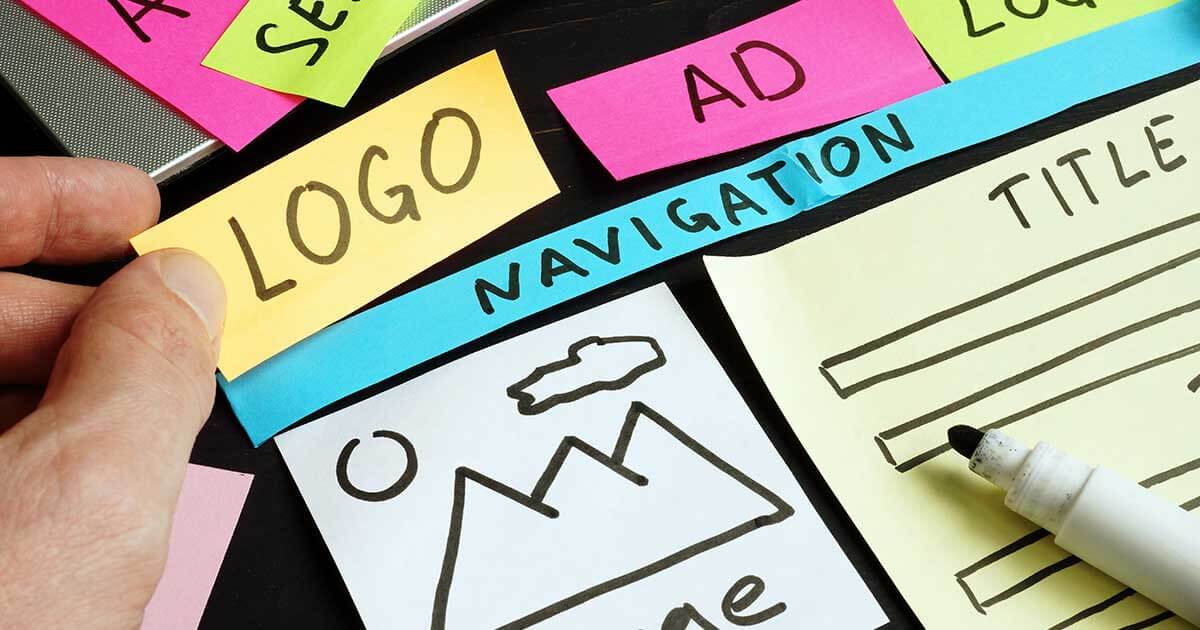
Core Elements of Web Design
The foundation of effective web design rests on five core elements that work together to create cohesive digital experiences:
Layout and Composition form the structural backbone of your website. A well-planned layout guides users through your content intuitively, using grid systems and strategic placement to create visual hierarchy and ensure content flows logically from one section to the next.
Typography does more than make text readable. It conveys personality, establishes hierarchy, and enhances brand identity. Modern web design embraces diverse typefaces while maintaining excellent readability across all devices and screen sizes.
Color Theory influences emotion, brand perception, and user behavior. Strategic color choices can increase conversion rates, improve accessibility, and strengthen brand recognition while creating visual harmony throughout your site.
Images and Multimedia serve multiple purposes beyond decoration. Quality visuals support your message, break up text, and create emotional connections with users. However, they must be optimized to maintain fast loading speeds.
Navigation Systems act as roadmaps for your users. Effective navigation is intuitive, consistent, and allows users to find information quickly while understanding their current location within your site architecture.
Essential Web Design Principles Every Designer Should Know
Successful web design follows proven principles that prioritize user needs while achieving business objectives. These time-tested guidelines form the foundation of exceptional digital experiences.
User-Centered Design (UCD)
User-centered design puts your audience at the heart of every design decision. This approach begins with thorough research to understand your users’ goals, preferences, pain points, and behaviors. Creating detailed user personas helps designers make informed decisions about layout, content prioritization, and feature development.
Understanding your target audience means conducting user interviews, analyzing website analytics, and testing design concepts with real users. This research reveals insights that assumptions simply cannot provide, leading to designs that truly serve user needs.
Accessibility considerations are integral to user-centered design, not afterthoughts. Following Web Content Accessibility Guidelines (WCAG) ensures your site serves users with disabilities, which comprises approximately 15% of the global population. Accessible design often improves usability for all users, creating a better experience across the board.
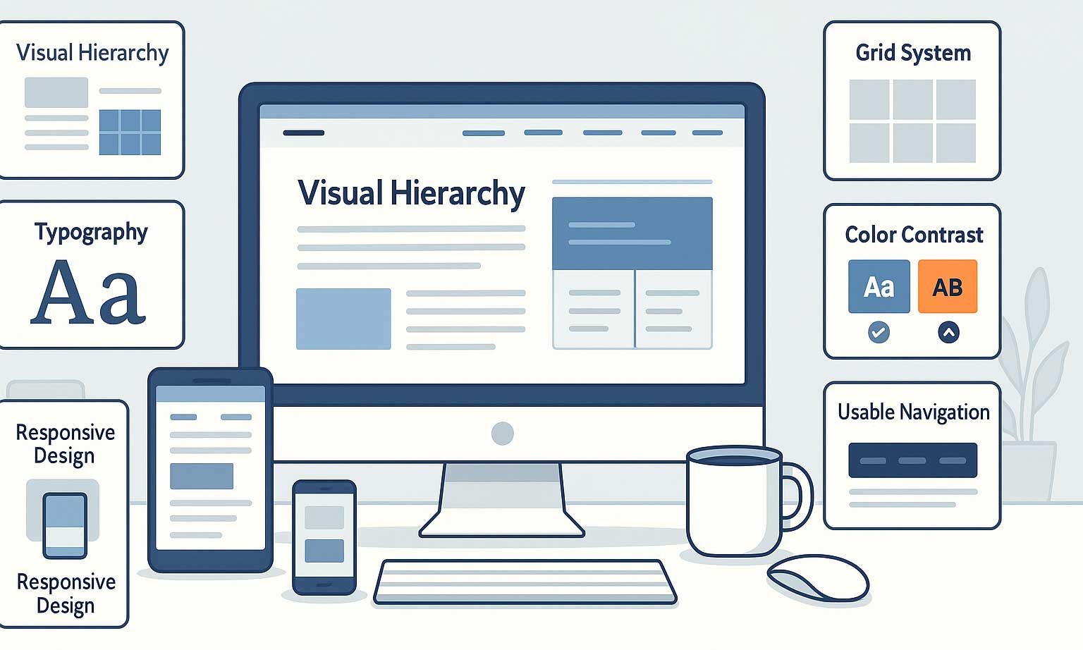
Visual Hierarchy and Information Architecture
Visual hierarchy guides users through your content in order of importance. This principle uses size, color, contrast, and positioning to direct attention and create a clear reading path. Most users scan websites in predictable patterns, the F-pattern for text-heavy pages and the Z-pattern for more visual content.
Strategic use of whitespace (negative space) gives content room to breathe and prevents cognitive overload. Whitespace isn’t wasted space, it’s a powerful design tool that improves comprehension and creates emphasis.
Information architecture involves organizing and structuring content logically. A well-planned information architecture helps users find what they need quickly while supporting your business goals through strategic content placement and user flow design.
Responsive Design Principles
Responsive design ensures your website provides optimal viewing experiences across all devices and screen sizes. With mobile traffic accounting for over 50% of web usage, responsive design isn’t optional, it’s essential.
The mobile-first approach designs for the smallest screen first, then progressively enhances the experience for larger screens. This methodology ensures core functionality and content remain accessible regardless of device limitations.
Flexible grid systems and fluid images adapt to different screen sizes seamlessly. CSS Grid and Flexbox provide powerful tools for creating layouts that respond naturally to viewport changes while maintaining design integrity.
Progressive enhancement starts with a basic, functional experience that works everywhere, then adds enhanced features for users with modern browsers and faster connections. This approach ensures accessibility while embracing innovation.
Current Web Design Trends for 2025
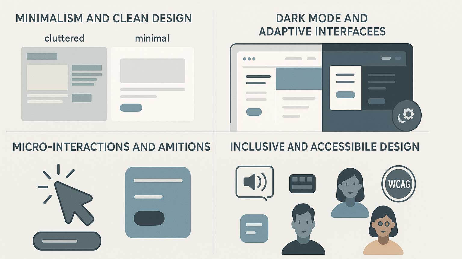
Minimalism and Clean Design
Minimalist design continues to dominate web design, but it’s evolved beyond stark simplicity. Modern minimalism focuses on purposeful reduction, removing unnecessary elements while strengthening essential ones. This approach improves loading speeds, reduces cognitive load, and creates timeless designs that age well.
Effective minimalist designs use generous whitespace, limited color palettes, and clean typography to create sophisticated, professional appearances. The key lies in strategic reduction rather than emptiness. Every element must serve a purpose and contribute to the overall user experience.
Benefits extend beyond aesthetics. Minimalist designs typically load faster, perform better on mobile devices, and require less maintenance. They also tend to have better conversion rates as users face fewer distractions from primary calls-to-action.
Dark Mode and Adaptive Interfaces
Dark mode has transitioned from niche preference to mainstream expectation. Beyond its sleek appearance, dark mode reduces eye strain in low-light environments, conserves battery life on OLED displays, and provides an alternative brand expression.
Implementing dark mode requires careful consideration of contrast ratios, color adjustments, and imagery optimization. What works in light mode doesn’t automatically translate to dark mode, colors need adjustment, and images may require different treatments to maintain visibility and impact.
Adaptive interfaces go beyond light and dark modes to adjust based on user preferences, device capabilities, and environmental conditions. This personalization improves user satisfaction and accessibility without requiring manual configuration.
Micro-interactions and Animations
Micro-interactions provide feedback for user actions, making interfaces feel responsive and alive. These subtle animations guide users, confirm actions, and add personality to digital experiences. When done well, micro-interactions feel natural and enhance usability.
Effective micro-interactions serve functional purposes. They indicate loading states, show system status, or provide feedback for user actions. Decorative animations should be used sparingly and never interfere with core functionality or accessibility.
Performance considerations are crucial when implementing animations. Smooth 60fps animations require careful optimization, and designers must provide options to disable motion for users with vestibular disorders or motion sensitivities.
Inclusive and Accessible Design
Inclusive design goes beyond meeting compliance requirements to create truly welcoming experiences for all users. This approach considers diverse abilities, technologies, cultural contexts, and user circumstances from the beginning of the design process.
Real business impact accompanies inclusive design. Companies that prioritize accessibility often see improved SEO rankings, expanded market reach, enhanced brand reputation, and reduced legal risks. Accessible designs typically benefit all users, not just those with disabilities.
Modern accessibility tools make testing easier than ever. Automated testing catches obvious issues, while manual testing and user feedback ensure real-world usability. Building accessibility into your design process from the start is far more efficient than retrofitting later.
The Web Design Process: From Concept to Launch
Discovery and Research Phase
Every successful web design project begins with thorough discovery and research. This phase involves understanding the client’s business goals, target audience, competitive landscape, and technical requirements. Comprehensive discovery prevents costly revisions and ensures the final design aligns with objectives.
Client requirements gathering goes beyond asking what they want. It uncovers why they need it and how success will be measured. Understanding business objectives helps designers make informed decisions throughout the project and propose solutions that drive results.
Competitor analysis reveals industry standards, identifies opportunities for differentiation, and highlights potential pitfalls. Studying competitors doesn’t mean copying them—it means understanding the landscape and finding ways to stand out while meeting user expectations.
Technical considerations include content management system requirements, third-party integrations, performance targets, and browser support needs. Addressing these early prevents roadblocks during development and ensures feasibility of design concepts.
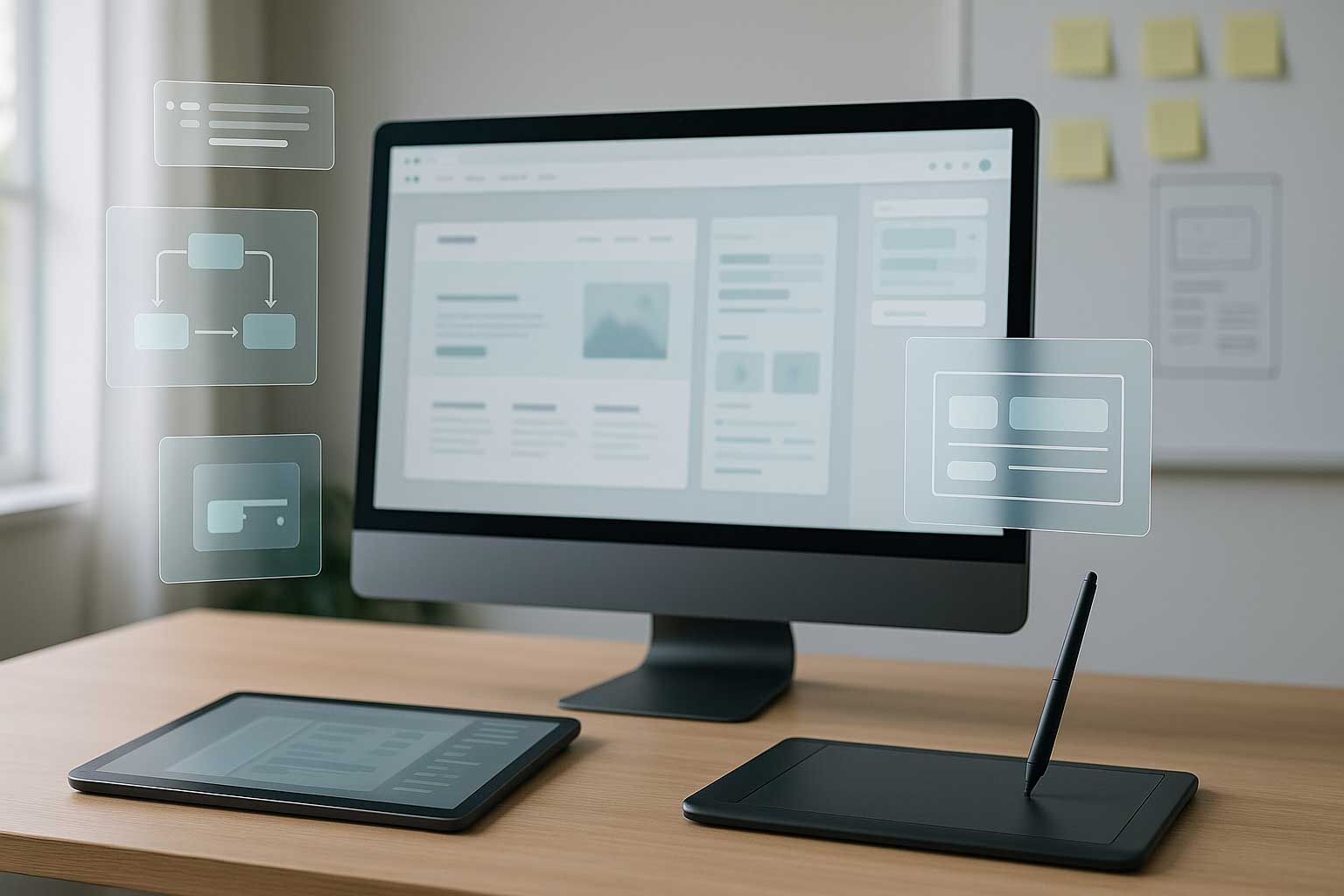
Wireframing and Prototyping
Wireframes and prototypes bridge the gap between abstract concepts and concrete designs. This phase tests ideas quickly and cheaply, allowing for iteration before investing in detailed visual design.
Low-fidelity wireframes focus on structure and functionality without visual details. These simple layouts help stakeholders understand content organization and user flows without getting distracted by colors, fonts, or images.
High-fidelity prototypes include visual design elements and interactive behaviors. They provide a more realistic preview of the final product and help identify usability issues before development begins.
An iterative approach embraces feedback and refinement throughout the wireframing and prototyping phase. Regular reviews with stakeholders ensure alignment and catch potential issues early when they’re easier and cheaper to fix.
Design and Development Handoff
Smooth handoffs between design and development teams require clear communication, comprehensive documentation, and mutual understanding of constraints and possibilities.
Design systems and style guides provide developers with complete specifications for implementing designs consistently. These resources include color codes, typography rules, spacing guidelines, and component specifications that ensure accurate translation from design to code.
Quality assurance and testing begin during development and continue through launch. Regular reviews ensure designs are implemented correctly and function properly across different browsers and devices.
Launch and Post-Launch Optimization
Pre-launch checklists ensure nothing is overlooked in the excitement of going live. Testing forms, verifying links, optimizing images, and checking mobile responsiveness prevent embarrassing oversights and user frustration.
Performance optimization continues after launch through monitoring, testing, and refinement. Regular analysis of user behavior reveals opportunities for improvement and ensures the site continues to serve its intended purpose effectively.
Ongoing maintenance keeps websites secure, functional, and current. Regular updates, security patches, and content refreshes maintain user experience quality and search engine rankings over time.
Essential Tools and Software for Web Designers
The right tools can dramatically improve design efficiency, collaboration, and output quality. Modern web designers have access to an unprecedented range of software options for every stage of the design process.
Design Software
Adobe Creative Suite remains the industry standard, with Photoshop for image editing, Illustrator for vector graphics, and XD for user experience design. These tools integrate seamlessly and provide comprehensive capabilities for complex design projects.
Figma has revolutionized collaborative design with its browser-based platform that enables real-time collaboration. Teams can work simultaneously on designs, share feedback instantly, and maintain a single source of truth for design files.
Sketch continues to be popular among Mac users for its intuitive interface and extensive plugin ecosystem. Its vector-based approach and symbols system make it particularly well-suited for user interface design.
Alternative tools like Canva democratize design for non-designers, while Affinity Designer provides professional capabilities at a fraction of the cost of Adobe products. The tool you choose should match your needs, budget, and workflow requirements.
Prototyping and Collaboration Tools
InVision and Marvel excel at creating interactive prototypes from static designs. These tools allow designers to demonstrate user flows and gather feedback on functionality before development begins.
Miro and Mural facilitate brainstorming, user journey mapping, and collaborative workshops. These digital whiteboard tools help teams align on concepts and visualize complex user experiences together.
Communication tools like Slack and Microsoft Teams keep project teams connected and ensure important decisions and feedback don’t get lost in email threads. Integrated file sharing and commenting features streamline the review process.
Development Handoff Tools
Zeplin automatically generates design specifications from design files, providing developers with exact measurements, colors, and CSS code snippets. This automation reduces errors and speeds up implementation.
Abstract provides version control for design files, allowing teams to track changes, merge updates, and maintain design history. This capability is especially valuable for larger teams and complex projects.
GitHub and GitLab integration enables designers and developers to work more closely together, tracking design changes alongside code updates and ensuring everyone stays synchronized.
Web Design Best Practices for Performance and SEO
Site Speed Optimization
Site speed directly impacts user experience and search rankings. Google considers page speed a ranking factor, and users expect pages to load within 2-3 seconds. Slow sites have higher bounce rates and lower conversion rates.
Image optimization is often the most impactful performance improvement. Proper compression, next-generation formats like WebP, and responsive images that serve appropriate sizes for different devices can dramatically reduce loading times.
Lazy loading delays loading of off-screen images and videos until users scroll to them. This technique improves initial page load times while ensuring all content remains accessible to users who need it.
Critical rendering path optimization prioritizes loading essential content first. By identifying and optimizing the critical resources needed for above-the-fold content, sites can feel faster even if total load time remains unchanged.
SEO-Friendly Design Considerations
Search engine optimization begins with design and information architecture decisions. Clean, semantic HTML structure helps search engines understand and index your content effectively.
Proper heading hierarchy (H1, H2, H3) provides clear content structure for both users and search engines. Each page should have one H1 tag that clearly describes the page’s main topic, with subsequent headings creating logical content hierarchy.
Alt text for images serves dual purposes. It improves accessibility for screen reader users and provides context for search engines. Descriptive, relevant alt text can improve image search rankings and overall page SEO.
Internal linking strategy helps search engines understand site structure and distributes page authority throughout your site. Strategic internal links also help users discover related content and stay engaged longer.
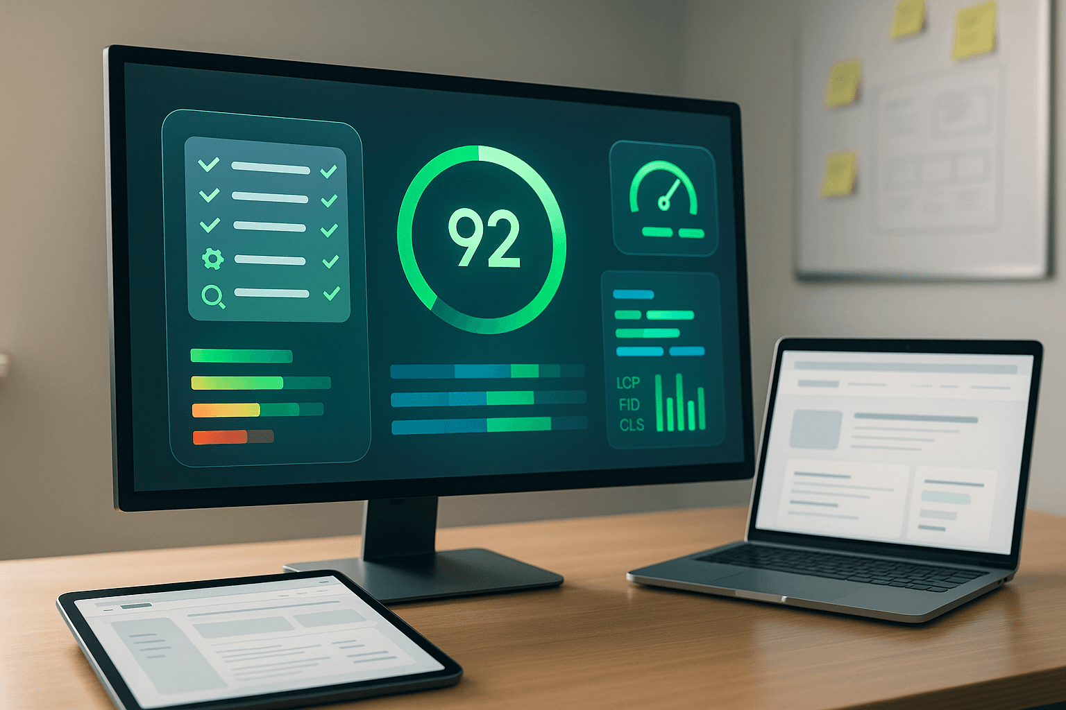
Core Web Vitals and User Experience
Core Web Vitals are Google’s metrics for measuring user experience quality. These factors directly impact search rankings and user satisfaction.
Largest Contentful Paint (LCP) measures loading performance. Good LCP scores require optimized images, efficient server response times, and streamlined CSS and JavaScript delivery.
First Input Delay (FID) measures interactivity. Reducing JavaScript execution time and optimizing third-party scripts improves FID scores and user experience.
Cumulative Layout Shift (CLS) measures visual stability. Reserving space for images, ads, and dynamic content prevents unexpected layout shifts that frustrate users and hurt search rankings.
Common Web Design Mistakes to Avoid
Navigation and Usability Issues
Overly complex navigation confuses users and increases bounce rates. Navigation should be simple, predictable, and consistent across all pages. Users shouldn’t have to think about how to find basic information or complete essential tasks.
Missing or unclear calls-to-action leave users uncertain about next steps. Every page should have a clear purpose and guide users toward desired actions through prominent, well-designed buttons and links.
Poor mobile experience alienates the majority of users who access websites on smartphones and tablets. Mobile-specific considerations include touch-friendly button sizes, simplified navigation, and thumb-friendly design patterns.
Visual Design Pitfalls
Inconsistent branding weakens brand recognition and appears unprofessional. Consistent use of colors, fonts, imagery, and visual styles throughout the site reinforces brand identity and builds trust.
Poor contrast and readability make content inaccessible to many users. Sufficient color contrast ratios ensure text remains readable for users with visual impairments and in various lighting conditions.
Overuse of stock photography creates generic, uninspiring experiences. While stock photos can be useful, overreliance on obvious stock imagery makes brands appear inauthentic and interchangeable.
Technical and Performance Issues
Slow loading times frustrate users and hurt search rankings. Regular performance monitoring and optimization ensure sites remain fast as content and features are added over time.
Broken links and forms create poor user experiences and can cost businesses leads and sales. Regular testing and maintenance prevent these issues from affecting users and damaging credibility.
Cross-browser compatibility problems exclude users based on their browser choice. Testing across different browsers and devices ensures consistent experiences for all users.
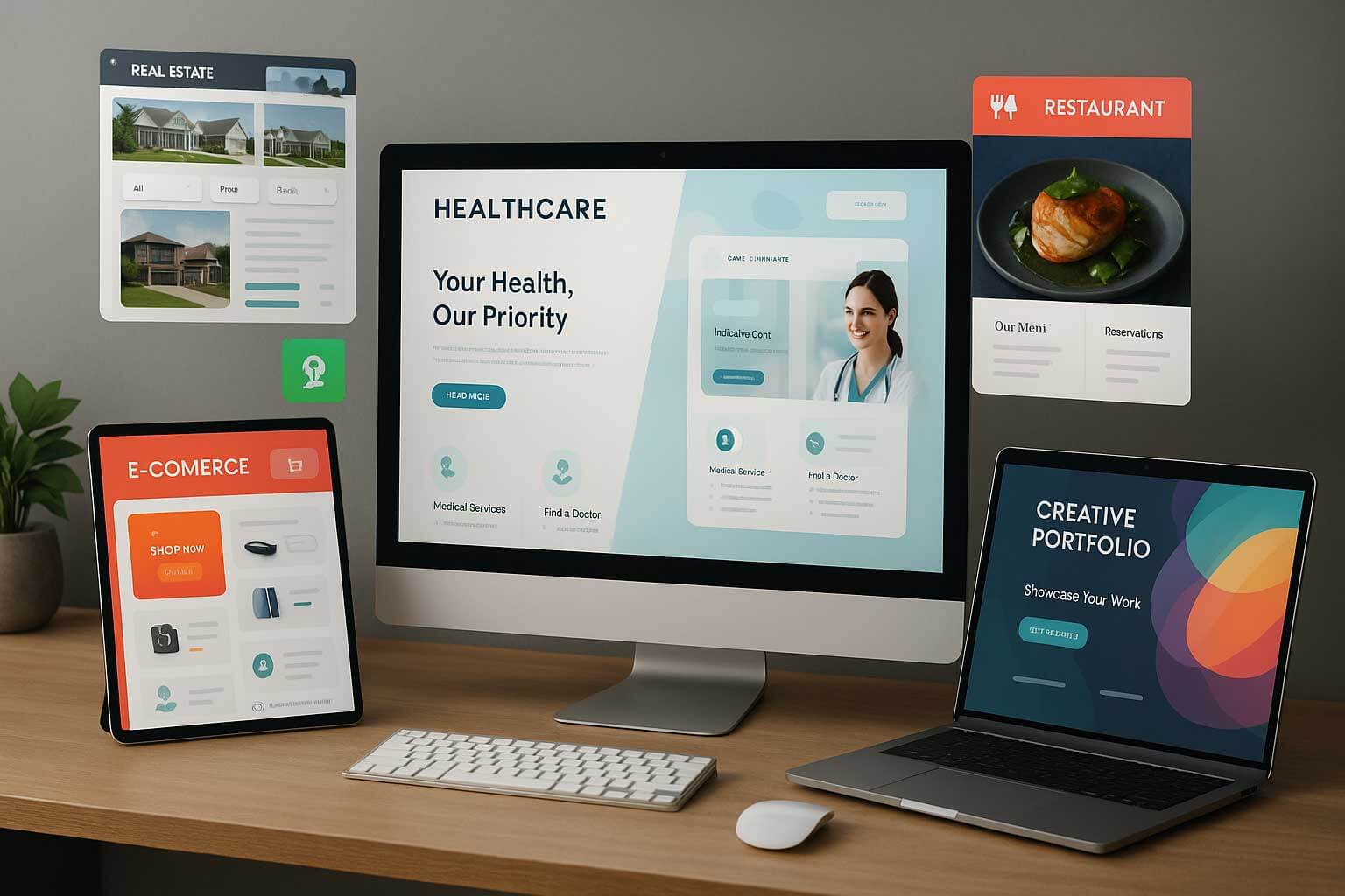
Web Design in Different Industries
Different industries have unique design requirements, user expectations, and conversion goals. Understanding these nuances helps create more effective designs for specific contexts.
E-commerce Design Considerations
E-commerce sites require careful balance between product showcasing and conversion optimization. Product pages need high-quality images, detailed specifications, customer reviews, and clear purchase workflows.
Checkout flow design can make or break e-commerce success. Simplified forms, multiple payment options, guest checkout capabilities, and clear progress indicators reduce abandonment rates and increase conversions.
Trust signals and security indicators reassure customers about transaction safety. SSL certificates, security badges, customer testimonials, and clear return policies build confidence in online purchases.
Corporate and Professional Services
Corporate websites must establish credibility and expertise while generating leads. Professional design aesthetics, comprehensive service descriptions, team member profiles, and case studies build trust with potential clients.
Lead generation optimization focuses on capturing and nurturing prospects. Strategic form placement, compelling calls-to-action, valuable content offers, and clear contact information facilitate business development.
Professional imagery and content reflect company culture and capabilities. High-quality photos, thoughtful copywriting, and consistent brand presentation differentiate businesses from competitors.
Creative and Portfolio Websites
Portfolio sites balance showcasing creativity with maintaining usability. The design itself becomes part of the portfolio, demonstrating design skills while presenting work effectively.
Effective work showcasing includes context, process explanation, and results achieved. Simply displaying finished products doesn’t tell the full story that potential clients or employers want to see.
Fast loading for image-heavy content requires careful optimization without compromising visual quality. Lazy loading, image compression, and progressive enhancement ensure portfolios remain accessible and engaging.

Future of Web Design: Emerging Technologies
AI and Machine Learning in Design
Artificial intelligence increasingly assists designers with automated tasks, design generation, and optimization suggestions. AI tools can create layouts, suggest color palettes, and even write copy, allowing designers to focus on creative and strategic decisions.
Personalization at scale becomes possible through machine learning algorithms that adapt content and design elements based on user behavior, preferences, and context. This technology creates more relevant, engaging experiences for individual users.
AI-powered testing and optimization continuously improve design performance through automated A/B testing, heat map analysis, and user behavior prediction. These tools help designers make data-driven decisions about design improvements.
Voice User Interfaces (VUI)
Voice interactions expand beyond smart speakers to websites and applications. Designing for voice requires new interaction paradigms that prioritize conversational flows and audio feedback.
Smart speaker integration creates opportunities for brands to extend their web presence into voice-activated devices. This expansion requires considering how content translates to audio-only experiences.
Accessibility implications of voice interfaces are significant, as they provide alternative interaction methods for users with mobility impairments while potentially creating challenges for users with hearing impairments.
Augmented and Virtual Reality
WebAR and WebVR technologies bring immersive experiences directly to web browsers without requiring app downloads. These technologies enable virtual product try-ons, interactive tours, and immersive storytelling.
Immersive shopping experiences allow customers to visualize products in their own spaces or navigate virtual stores. This technology reduces return rates and increases customer satisfaction by providing better product understanding.
Design considerations for 3D environments require new skills and approaches. Spatial design, 3D modeling, and performance optimization become essential for creating effective AR and VR web experiences.
Let’s Recap
Modern web design encompasses far more than visual aesthetics. It requires understanding user psychology, technical performance, business objectives, and emerging technologies. The best websites seamlessly blend beautiful design with exceptional functionality, creating experiences that delight users while achieving business goals.
As we’ve explored throughout this guide, successful web design relies on established principles while embracing innovation and emerging trends. The key lies in maintaining focus on user needs while leveraging new technologies and design approaches to create increasingly sophisticated digital experiences.
The web design field continues evolving rapidly, with new tools, techniques, and technologies constantly emerging. Staying curious, continuing to learn, and always prioritizing user experience will serve you well regardless of how the industry changes.
Whether you’re designing your first website or your hundredth, remember that great web design is ultimately about connecting people with the information, products, or services they need in the most effective way possible. By focusing on this fundamental purpose while applying the principles and practices outlined in this guide, you’ll create web designs that truly make a difference.
Ready to put these insights into practice? Start by auditing your current website or beginning your next project with user research and clear objective setting. Remember, the best time to implement these web design best practices is now. Your users and your business will thank you for the investment.


