Why Your Small Business Website Needs Strong Call-to-Action Elements
Have you noticed visitors coming to your website but leaving without taking any action? This common challenge affects small businesses across all industries. Research from WordStream shows that the average landing page conversion rate across industries is just 2.35%, with the top 25% of sites converting at 5.31% or higher. This significant gap demonstrates how much room for improvement exists for the typical small business website.
When visitors land on your site, they need clear direction about what to do next. Without effective CTAs, even interested prospects may leave without connecting with your business. Your call-to-action elements serve as strategic signposts, guiding potential customers toward the actions that benefit both them and your business.
During my work with a local accounting firm, we discovered their website attracted substantial traffic but generated few leads. After implementing targeted CTA strategies, their contact form submissions increased by 67% within just two months. Your small business can achieve similar results with the right approach.

The Psychology Behind Effective Call-to-Action Strategies
Understanding what motivates people to click, subscribe, or buy can dramatically improve your website’s effectiveness. Consumer psychology research reveals several principles that make CTAs more compelling:
The principle of scarcity makes offers seem more valuable when availability appears limited. Phrases like “Limited time offer” or “Only 5 spots remaining” tap into the fear of missing out.
The principle of social proof leverages our tendency to follow others’ actions. Incorporating elements like “Join over 500 satisfied customers” can increase conversion rates by up to 15%, according to a study by Nielsen Norman Group.
The principle of reciprocity explains why offering something valuable before asking for action improves response rates. This is why free downloads, trials, or valuable information often precede CTAs.
One small business client in the health supplements industry experienced this firsthand. After we added “Only 24 hours left” to their promotional CTA buttons, their click-through rate jumped 28%. While urgency worked for this promotion, the key is matching psychological triggers to your specific audience needs.

Essential Elements of High-Converting CTA Design
The visual design of your call-to-action elements significantly impacts their performance. For small business websites with limited traffic, every interaction opportunity must be optimized. Consider these design elements:
Button color and contrast: Research by HubSpot found that red buttons can outperform green ones by 21% in some contexts, though what matters most is how your CTA stands out from surrounding content. The button should create visual tension that draws attention.
Size and placement: CTAs should be large enough to notice but not overwhelming. For maximum impact, place primary CTAs above the fold where visitors see them without scrolling. For longer pages, strategically repeat CTAs at natural decision points.
White space: Surrounding your CTA with adequate white space increases visibility and reduces competition for attention. Studies show elements with breathing room receive more focused attention and higher click rates.
A restaurant client of ours struggled with online reservation conversions until we redesigned their CTA buttons with contrasting orange (instead of site-matching blue) and added 30% more white space around them. Reservation requests increased by 41% the following month.

Crafting Compelling CTA Copy That Converts
The words you choose for your CTA can make or break its effectiveness. Strong call-to-action copy shares several characteristics:
Action-oriented language: Begin with commanding verbs that clearly state what action you want visitors to take: “Get,” “Start,” “Join,” “Discover,” or “Learn.”
Value-focused phrasing: Emphasize what users gain rather than what they must do. “Get Your Free Guide” performs better than “Download” because it highlights the benefit.
Personalization: Using “my” or “your” creates ownership before the action occurs. “Start My Free Trial” converts better than “Start Free Trial” because it feels more personal.
Specificity: Clear, specific CTAs generally outperform vague ones. “Schedule Your 15-Minute Consultation” typically works better than “Learn More.”
We recently worked with a plumbing company whose generic “Contact Us” button generated minimal leads. When we changed it to “Get Your Free Quote in 2 Hours,” form submissions increased by 36%, and qualified leads improved by 52%.

Where to Position CTAs on Your Small Business Website
Where you place your call-to-action elements significantly impacts their performance. Strategic positioning considers both user psychology and website flow:
Homepage placement: Your homepage should include at least one primary CTA above the fold and secondary CTAs that guide different audience segments. Research shows that 80% of users’ attention focuses above the fold, making this prime real estate for conversion elements.
Service/product pages: Each service page should include CTAs tailored to that specific offering, positioned immediately after you’ve established value and before testimonials that reinforce trust.
Blog content: Within articles, place contextual CTAs where they naturally fit the content rather than interrupting the reading flow. Mid-article CTAs work best when they offer something directly related to what the reader is currently learning.
Exit-intent opportunities: Tools that detect when users might leave your site can present timely CTAs that capture conversions from otherwise lost visitors.
Effective CTA placement is a crucial element of small business website design that balances aesthetics with conversion strategy.
A retail client implemented exit-intent CTAs with a special discount code and captured 15% of departing visitors who otherwise would have left without purchasing.

Advanced CTA Strategies for Small Business Websites
Once you’ve implemented the basics, these advanced strategies can further enhance your website’s conversion performance:
Progressive CTAs: Change your call-to-action messaging based on whether someone is a first-time visitor, returning visitor, or existing customer. This personalized approach can increase conversion rates by up to 42%, according to research from Hubspot.
A/B testing approach: Systematically test different CTA variables including colors, copy, placement, and design. Even small businesses can implement simple A/B tests using tools like Google Optimize or built-in website builder features.
Multi-step CTAs: Break conversion processes into smaller commitments that feel less intimidating. Instead of immediately asking for contact information, first ask a simple question that engages the visitor.
Mobile optimization: With over 50% of web traffic now coming from mobile devices, ensure your CTAs are thumb-friendly (at least 44×44 pixels) and prominently visible on smaller screens. Mobile responsiveness is especially critical for e-commerce websites, where purchase decisions happen directly on the site.
We helped a local fitness studio implement progressive CTAs that showed different offers to new visitors versus those who had visited multiple times. This approach increased their trial membership sign-ups by 28% and reduced their cost per lead by 36%.

Common CTA Mistakes Small Businesses Make
Learning from others’ mistakes can help you avoid conversion pitfalls. These issues are among the common website mistakes that can hurt your brand that we’ve identified in our work with small businesses. Watch out for these common problems:
Competing calls to action: When multiple CTAs compete for attention, users often choose none. Focus each page on a primary conversion goal with supporting secondary CTAs.
Vague or generic language: “Click Here” or “Submit” fail to communicate value or generate excitement. Always specify what happens after the click.
Poor mobile responsiveness: CTAs that work well on desktop but disappear or become difficult to tap on mobile devices lose valuable conversion opportunities.
Asking for too much too soon: Forms with too many fields or CTAs that request big commitments before establishing value typically underperform. Start with low-commitment actions.
One e-commerce client increased their conversion rate by 22% simply by reducing competing CTAs on their product pages from five options to two clear choices: “Add to Cart” and “Learn More”.

Measuring and Improving Your CTA Performance
What gets measured gets improved. Track key metrics with tools like Google Analytics to optimize your call-to-action performance:
Click-through rate (CTR): The percentage of people who click your CTA after viewing it. Low CTRs suggest problems with button visibility, copy appeal, or offer relevance.
Conversion rate: The percentage of users who complete the desired action after clicking. Low conversion rates after clicking indicate issues with the post-click experience.
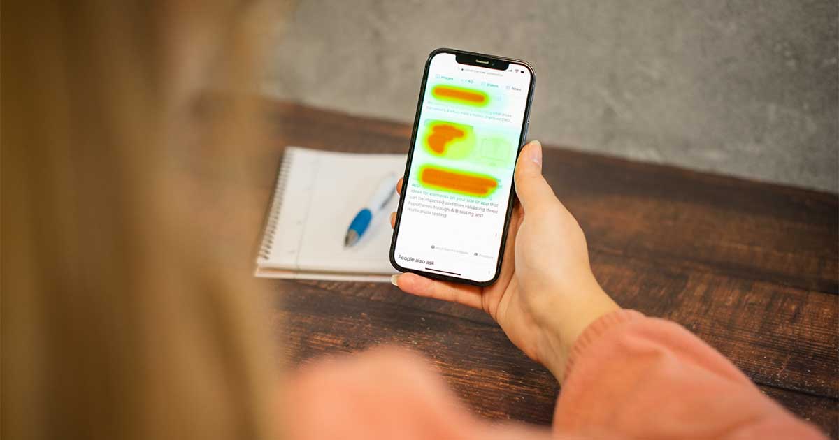
Heat mapping analysis: Visual representations showing where users click, how far they scroll, and where they focus attention can reveal whether your CTAs are even being seen.
A/B test results: Systematic testing of different CTA variations provides concrete data on what works best for your specific audience.
We helped a home services company improve their lead generation by analyzing heat maps that revealed their primary CTA was often missed. Moving it higher on the page and increasing its size resulted in a 47% improvement in qualified leads.
Frequently Asked Questions About Website CTAs
Each page should focus on one primary CTA that aligns with the main goal for that page. You can include secondary CTAs, but they shouldn’t compete with the main conversion action. For homepages, 3-5 total CTAs is typically effective, while service pages often perform best with 1-2 clear actions.
While orange and green buttons often perform well in tests, what matters most is contrast with your website’s color scheme. Your CTA should visually “pop” against surrounding elements. The most important factor is that the button looks clickable and stands out from other content.
For primary conversion actions like form submissions or purchases, keep users on the same page to maintain momentum. For secondary CTAs like “Learn More” links that provide additional information, opening in a new tab can be appropriate so users don’t lose their place in the conversion process.
Authentic urgency comes from real limitations or time-sensitive offers. Instead of false scarcity claims, focus on the genuine value of acting now: “Start saving today” or “Join before rates increase next week.” Only use countdown timers or limited quantity messaging when the limitations are real.
For small businesses, quarterly CTA reviews work well for most websites. However, during promotional periods or after significant traffic increases, more frequent testing can capture optimization opportunities. At minimum, test one CTA element monthly, whether it’s copy, color, placement, or design.
Taking Your Small Business Website to the Next Level
Creating truly effective call-to-action strategies requires understanding your specific audience, testing what resonates with them, and continuously refining your approach. The small businesses that see the best results treat their CTAs as evolving assets rather than set-and-forget elements.
Remember that the most effective call-to-action strategies align with your customers’ needs and your business goals. By implementing the techniques shared in this article, you can transform your website from a digital brochure into a powerful lead generation tool that drives meaningful business results.
Ready to transform your website’s performance with strategic, conversion-focused CTAs? Contact Blaser Consulting for a personalized website conversion analysis. We will identify your biggest opportunities and help implement changes that bring real business results.
Upgrading your website’s CTA strategy is just one of the many advantages to redesigning your website that can significantly impact your business results.
Get in touch today and start turning more visitors into valuable customers.


